
Azure Service Bus, a cloud-based messaging service, facilitates communication between applications and services. Within Azure Service Bus queues and topic subscriptions, there exists an additional sub-queue known as a Azure Service Bus dead-letter queue (DLQ). The Dead-Letter Queue (DLQ) serves as a storage area for messages that the receiving application from the main queue cannot deliver or process successfully. These messages are referred to as “dead-lettered” messages.
Why messages end up in Azure Service Bus dead-letter queue?
Messages can find their way into the Dead Letter Queue through a variety of different scenarios.
Exceeded delivery attempts
If a message fails to be processed after the maximum number of delivery attempts defined by the application, it is moved to the Dead-Letter Queue. This condition is typically used to avoid continuously processing a message that keeps failing.
Time-to-live (TTL) expiry
Messages have an associated time-to-live (TTL), which defines how long a message is valid and available for processing. If a message’s TTL exceeds the allowed duration, it will be moved to the Dead-Letter Queue.
Malformed messages
Messages that cannot be deserialized or don’t adhere to the expected message format are considered invalid. Such messages are moved to the Dead-Letter Queue for further analysis and correction.
Unrouteable messages
If a message is sent to a topic subscription but doesn’t match any subscription rules, it becomes an unrouteable message and is dead-lettered.
Maxed out queue size
Any additional messages sent to the queue will be dead-lettered when a message queue’s size limit is reached.
Why is Azure Service Bus dead letter queue monitoring necessary?
Setting up monitoring for Service Bus dead-letter queues is essential for several compelling reasons
Troubleshooting message processing failures
Dead-lettered messages often contain clues about the reasons for processing failures. By analysing the content and properties of these messages, we can pinpoint the root causes of issues, leading to more effective troubleshooting and faster resolution.
Preventing message loss
Dead-letter queues are a safety net for messages that couldn’t be processed successfully. Without monitoring, undetected issues in the main queue could lead to messages being continuously retried or lost entirely. Monitoring allows us to detect and address such problems promptly.
By leveraging Turbo360, you can elevate the monitoring of the Dead-Letter Queue in Azure Service Bus. This solution provides essential visibility into message processing issues, empowers proactive identification of potential problems, and facilitates continuous improvement for your messaging system.
Monitoring Azure Service Bus dead-letter queue with Turbo360
Turbo360 Business Application module caters to a wide range of business needs, enabling users to centralize Azure resources from different subscriptions and resource groups into a unified platform. This unified interface empowers users to effortlessly oversee and control these resources based on their individual preferences.
Turbo360 Business Application module offers a comprehensive solution called Azure Service Bus Monitoring Tool which provides intuitive monitoring features for the Azure Service Bus Dead-Letter Queue.
Monitoring rules for Azure Service Bus dead-letter queue
Monitoring rules for Azure Service Bus dead-letter queue refers to creating rules to track the messages moved to the queue within an Azure Service Bus. These rules help detect patterns, issues, or events in the dead-letter queue.
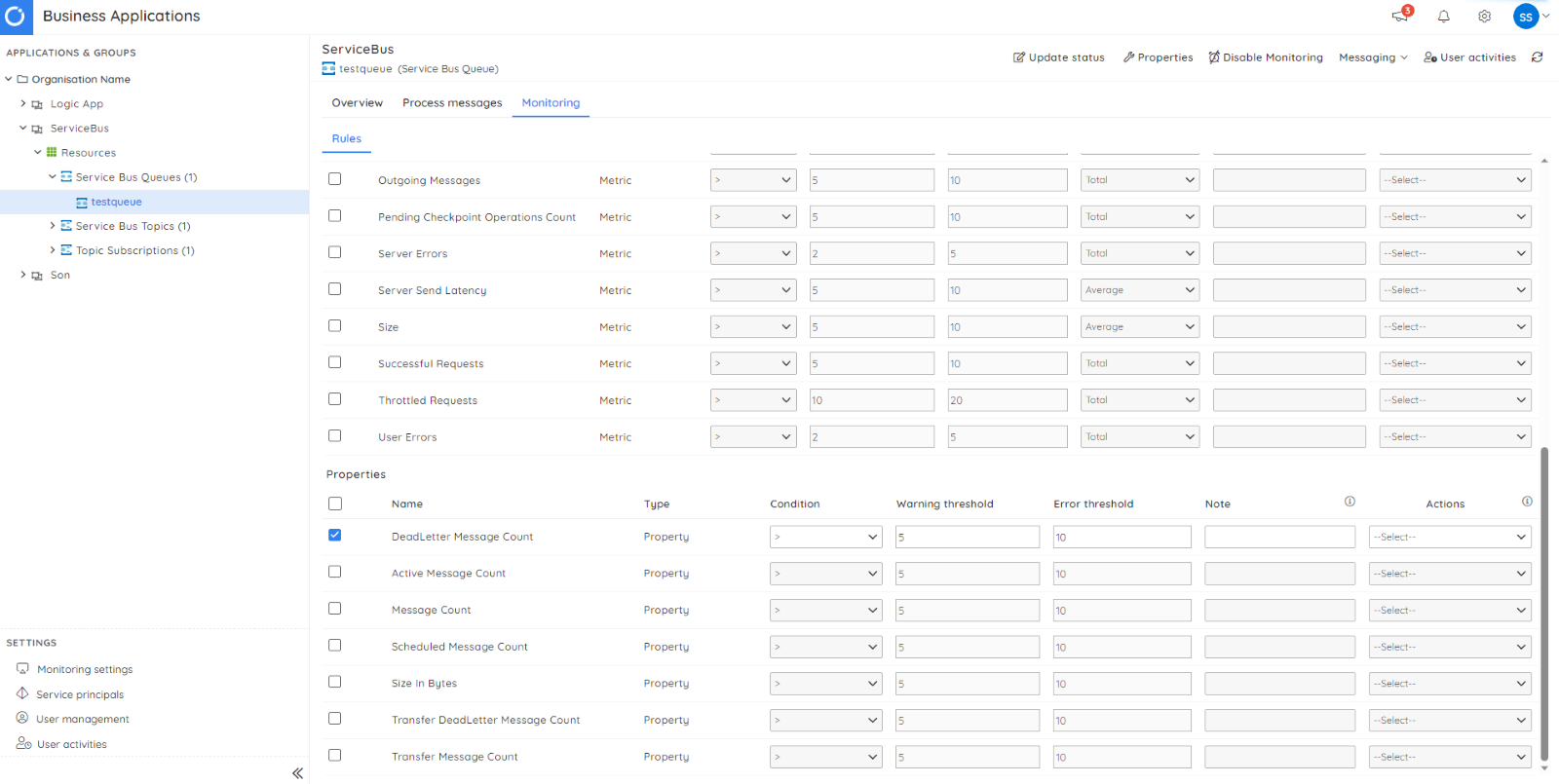
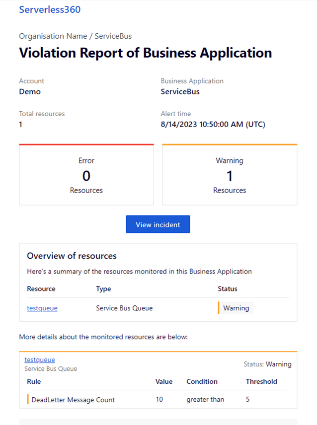
Azure Service Bus alert dead letter queue
For instance, if you activate a rule to monitor the count of dead-letter messages and the actual dead-letter count violates the rule, Turbo360 will promptly initiate notifications through various configured channels. These channels encompass well-known platforms like Microsoft Teams, Slack, and PagerDuty, allowing you to select the most appropriate channel for receiving timely alerts and updates.
Through the establishment of connections between Turbo360 and these channels, you can guarantee efficient and prompt communication whenever violations of monitoring rules take place.
How to handle dead letter queue in Turbo360?
Turbo360 offers various methods for effectively handling the dead-letter messages. This helps to empower users with seamless control over message processing and management. Some of the key features include:
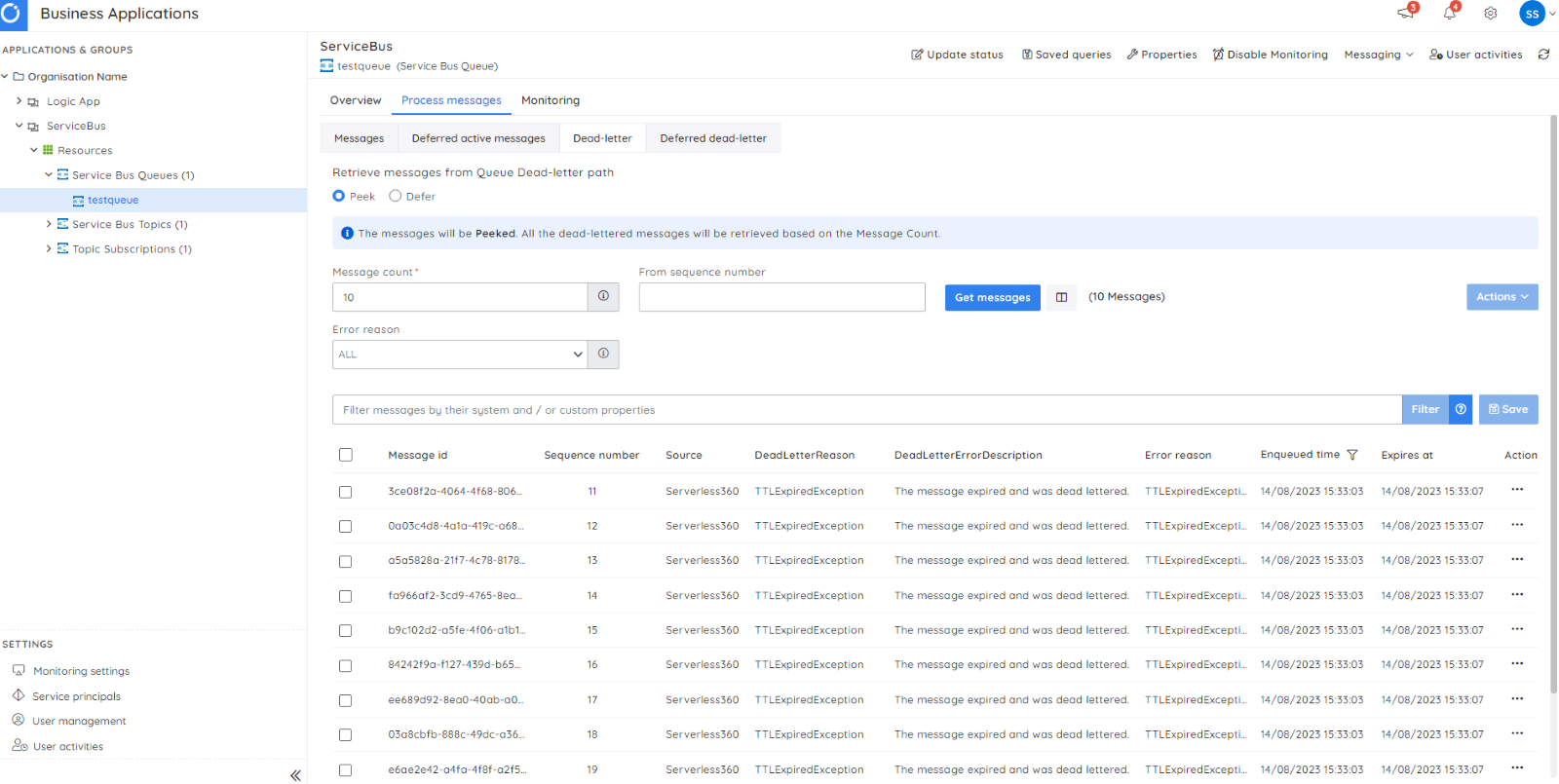
View messages
Turbo360 allows users to interact seamlessly with messages within Active-end and Dead-Letter queues. This unique functionality allows users to query messages in a targeted manner, even in specific states such as the Peek state, where the message can be examined without altering its status, or the Deferred state, where messages are temporarily set aside for processing later.
Furthermore, Turbo360 enhances this querying capability by allowing users to specify the exact message count they wish to retrieve, ensuring precise control over the volume of messages accessed. Users can also define a starting Sequence number, enabling them to seamlessly pick up messages from a specific point within the queue and streamline the retrieval process.
View message details
This includes a comprehensive overview of message attributes and associated metadata.
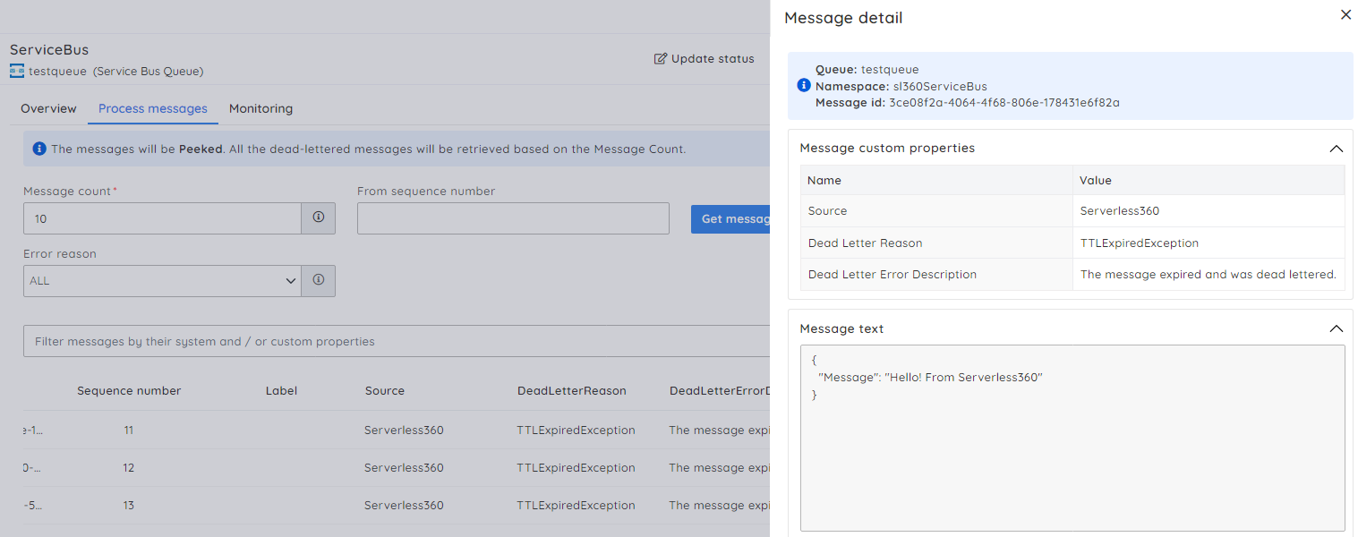
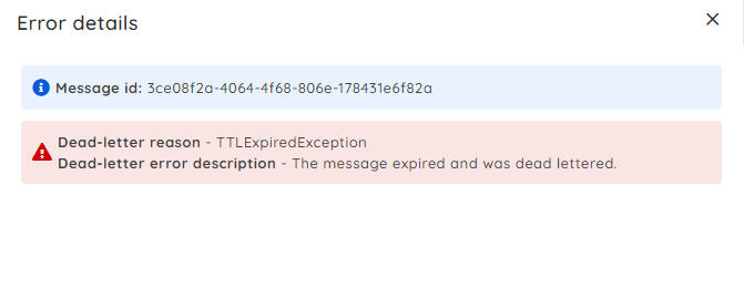
View Dead-letter Reason and Description
When messages end up in the dead-letter queue, Turbo360 empowers you to swiftly pinpoint the reason and comprehend the description, simplifying the debugging process.
Ensuring the removal of messages from the dead letter queue is a critical factor in maintaining a messaging system that operates seamlessly and efficiently. After these messages have been processed, either through resubmission or the necessary repairs followed by resubmission, they no longer hold significance or serve a purpose. Consequently, it becomes suitable to initiate the process of deleting these messages.
Azure service bus clear dead letter queue
Ensuring the removal of messages from the dead letter queue is a critical factor in maintaining a messaging system that operates seamlessly and efficiently. After these messages have been processed, either through resubmission or the necessary repairs followed by resubmission, they no longer hold significance or serve a purpose. Consequently, it becomes suitable to initiate the process of deleting these messages.
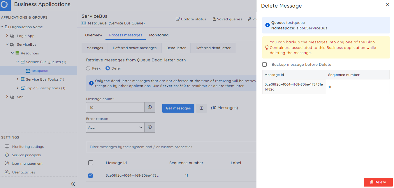
Backup Service Bus messages
Preserving data integrity is paramount. Turbo360’s “Backup” feature facilitates the creation of backups for messages, safeguarding against accidental data loss or corruption.
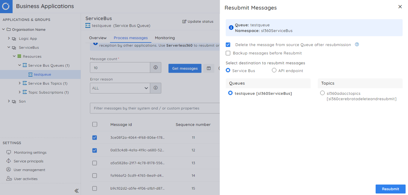
Resubmitting Service Bus dead letters
Turbo360 offers a convenient solution to initiate a resubmission process quickly. This functionality guarantees the reprocessing of service bus dead-letter messages, effectively reducing the risk of potential disruptions arising from unresolved issues. It is also possible to resubmit these messages to an API endpoint.
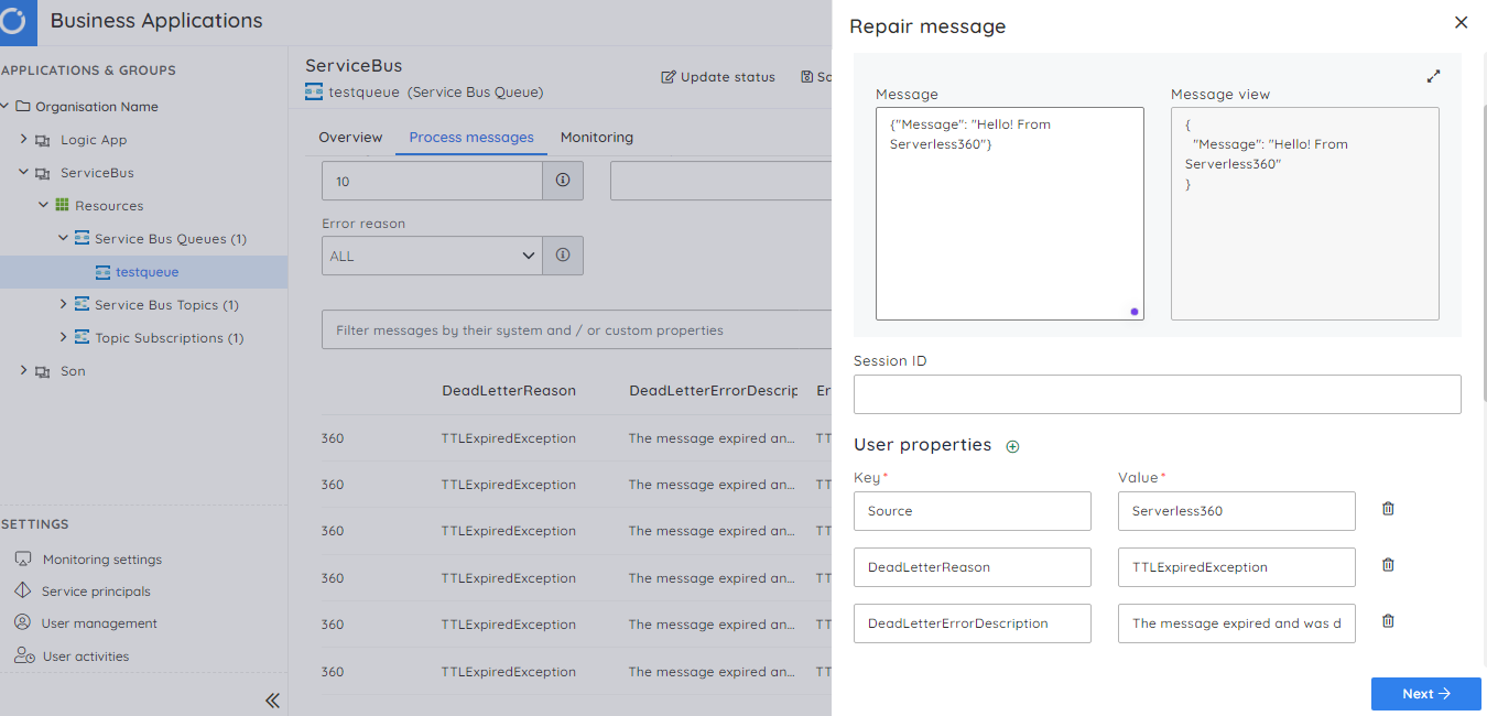
Repair and resubmit Service Bus dead letters
Imagine a situation in which a message turns into a dead letter because of issues with its content or properties. If these messages were to be re-sent without modifications, they would encounter another round of failure.
To effectively manage such scenarios, Turbo360 offers a “repair and resubmit capability.” This capability enables you to modify the message content and make necessary adjustments to its system properties and any user-defined attributes. By utilizing this capability, you can address any fundamental problems causing processing failures before initiating a resubmission.
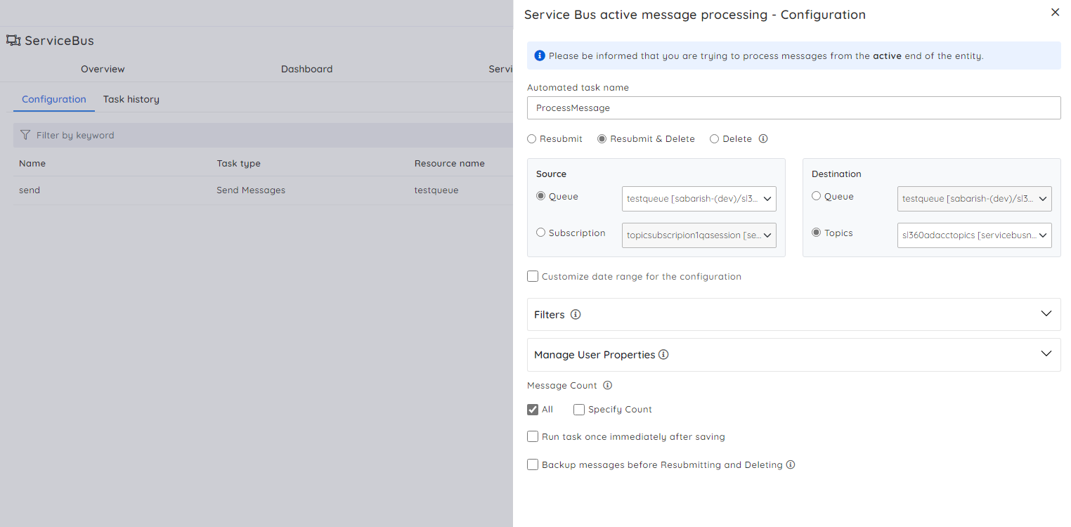
Configuring actions to automate the resolution
Turbo360 offers automated solutions for sending, receiving, repairing, resubmitting, and purging messages. This eliminates the need for manual intervention, saving valuable time and effort. Whether dealing with a high volume of messages or managing bulk message operations, Turbo360’s automation streamlines the process. These automated tasks can be set as a resolution action for monitor rules, so if an alert is triggered saying that the dead letter message count has reached its threshold, Turbo360 automatically picks the messages and either resubmits them or deletes them from the queue.
Conclusion
I hope this blog gave a better understanding of Azure Service Bus Dead Letter Queue. Considering enterprises that depend on Azure Service Bus, Turbo360 offers various features, enhancing its exceptional monitoring prowess.
These attributes encompass real-time alerts, promptly informing administrators about problems or irregularities in the dead-lettered queue. This proactive strategy facilitates quick corrective measures, thus reducing possible downtimes or interruptions in message processing.